Mobile SEO has become increasingly important because more and more people are browsing the web on their tablets and smartphones. With a dedicated mobile redirect, you will have one URL that is easily accessed by any device regardless of screen size or browser capabilities.
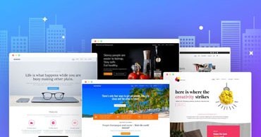
But if you’re running a website with content that is not formatted for mobile devices, then you can use responsive design to optimize your site for different screen sizes. In this article, I will compare these two options in order to help you choose which would be best for your business or organization.
What is Mobile SEO and why is it important?
Mobile SEO (Search Engine Optimization) is the process of optimizing your site for search engines so that it ranks higher in organic search results. The benefit of this is that when people are searching for products or services related to your business, they will be able to find you more easily.
When it comes to mobile SEO, it is important to optimize your website for different devices such as smartphones and tablets. Mobile search results now account for more than half of all Google searches, according to a study by SearchEngineLand.
There are two ways to optimize your site for mobile search engines:
- Dedicated Mobile Redirect
- Responsive Design
How does a dedicated mobile redirect work?
A dedicated mobile redirect is when you have one URL that points to the desktop version of your site, but when accessed on a mobile device it automatically redirects the user to the mobile version of your site. This is beneficial because Google sees all users accessing your website as coming from one source, which helps with your SEO efforts.
However, there are drawbacks to this technique. These are names that you have to maintain on two separate sites, which results in double the work since you will have to update and maintain content on both of them. You may also lose some organic search traffic if people don’t find your desktop version through search engines anymore.
How does responsive design work?
Responsive design is when you have one URL that points to the desktop version of your site, but when accessed on a mobile device it automatically redirects the user to a mobile-optimized version of your site. This allows you to have only one URL for both desktop and mobile users so you don’t have to maintain two separate sites.
However, there are caveats to this method that you should be aware of. You can only optimize your site for one screen size at a time, so if you change the design it will affect desktop users as well as mobile ones. This is not the best method if you have content on your website that does not convert well to mobile devices.
Which option is best for your business or organization?
When it comes to choosing between a dedicated mobile redirect or responsive design, it all comes down to the type of content you have on your site. If you have large quantities of text that are hard to read on mobile devices, then responsive design is not right for you. Responsive design leaves out any content that does not convert well into the mobile format.
A dedicated mobile redirect is the right choice for you if your site contains primarily text and images. It also works well with sites that have a lot of content, because it allows you to have two different URLs for each page so that users are able to access the desktop version as well.